
primary color
브랜드컬러는 주로 primary color 1가지와 secondary color 1가지로 제안합니다.
primary color는 브랜드를 대표하는 Main Color를 말합니다.(Key Color 또는 Point Color라고도합니다)
어떤 색을 선택하느냐에 따라 앱(웹)의 이미지가 달라지기 때문에 primary color를 정하는 것은 매우 중요하며
해당 서비스의 콘셉트를 잘 보여줄 수 있는 유의미한 컬러를 사용합니다.
보통 시안을 잡고 디자인을 확정하는 과정에서 주컬러와 보조컬러를 정의하게 될 것입니다.
Secondary & Tertiary Color
단색(포인트 컬러 1가지만 사용), 유사색(Primary Color 주변 색), 보색(Primary Color와 반대색)

Hierarchy & Action color
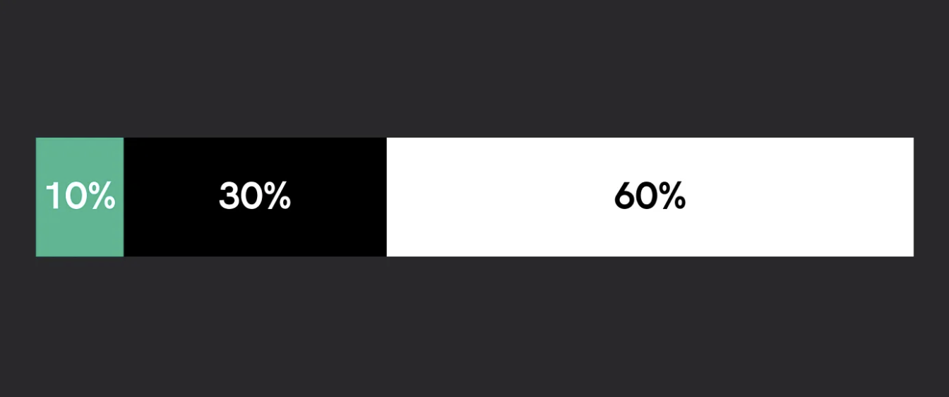
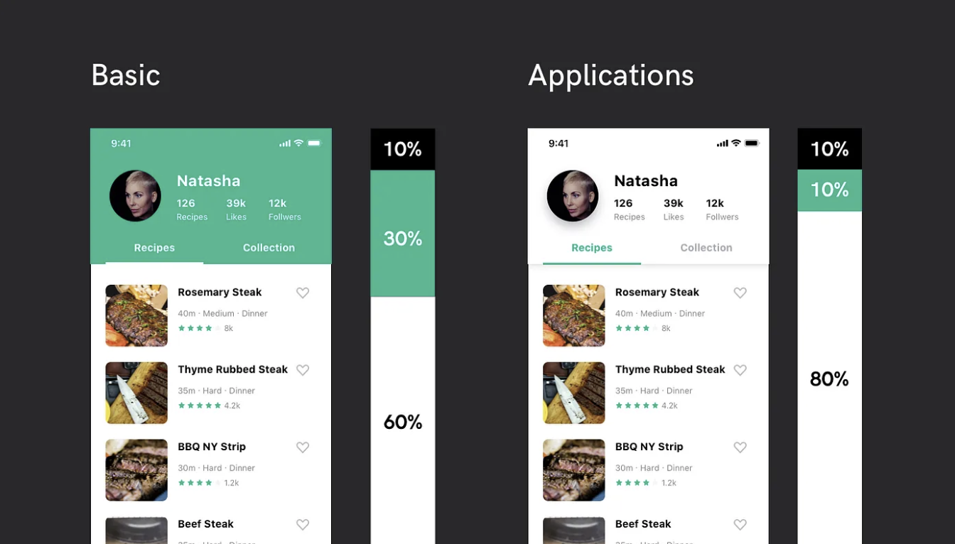
Ratio
주 컬러와 보조 컬러 그리고 배경 컬러를 어느 정도 비율로 할지 결정합니다
주로 60:30:10 또는 10:10:80으로 영억을 잡는데, 서비스 성격 또는 UI 콘셉트에 따라 적정 비율을 찾아야 합니다
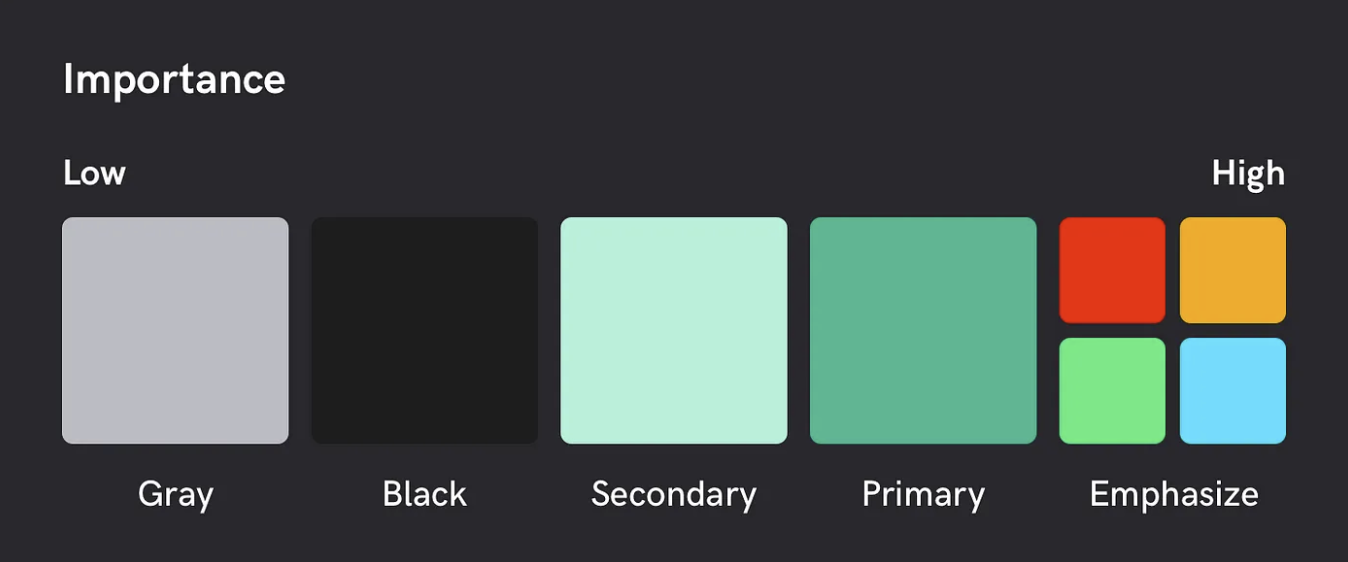
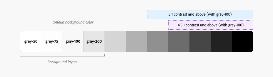
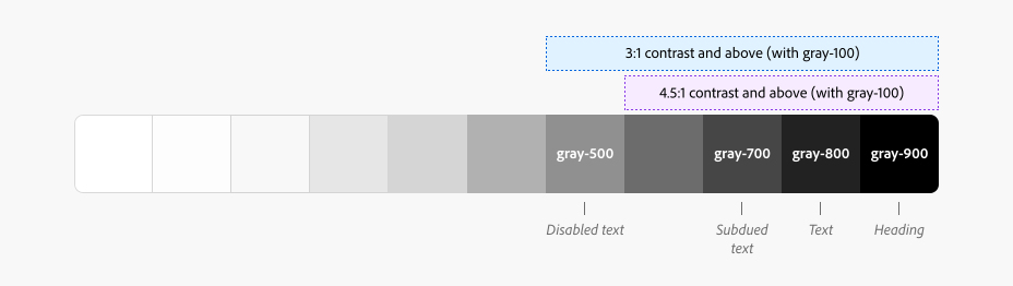
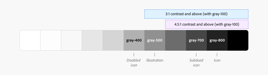
Gray Scale Colors
정보의 계층구조를 나타낼 때 사용하며 텍스트, 정보를 나누기 위한 구분선 요소에 사용되며, 가독성을 고려해서 명암비를 체크해야 합니다.
Gray 컬러를 Gray50, 100, 200, 300, 400, 500, 600, 700, 800 ,900까지 총 10단계로 나누어 필요에 따라 더 세분화하거나 간소화하여 사용합니다
W3C(World Wide Web Consortium)의 웹 접근성 지침인 WCAG(Web Content Accessibility Guidelines)의 기준
| 레벨 AA (최소대비) | 레벨 AAA (향상된 대비) |
| - 텍스트 Regular 18pt 이하는 배경 대비 4.5:1 - 텍스트 Regular 18pt, Bold 14pt 이상은 3:1의 대비율을 권장 |
- 텍스트 Regular 18pt 이하는 배경 대비 7:1 - 텍스트 Regular 18pt, Bold 14pt 이상은 4.5:1의 대비율을 권장 |

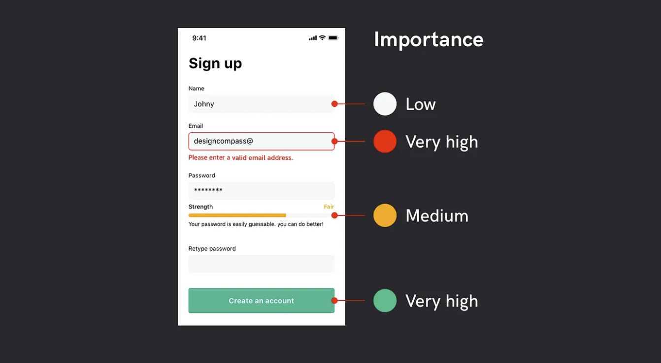
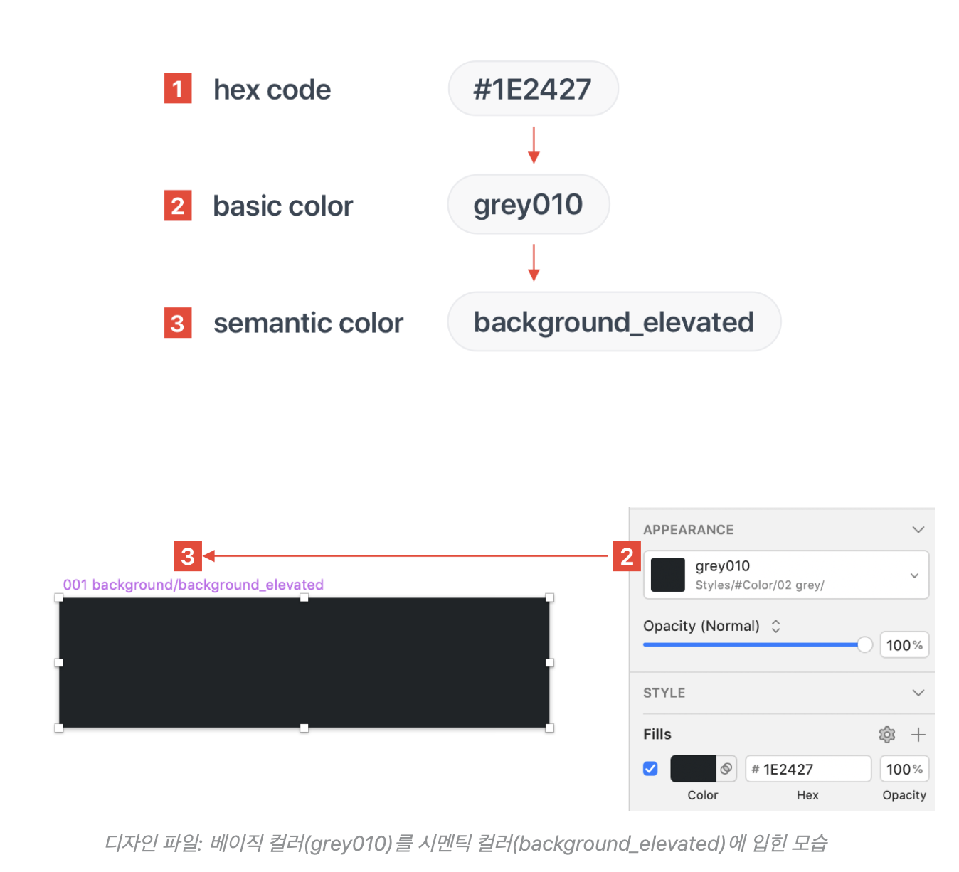
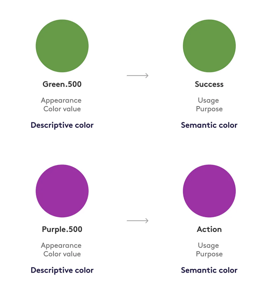
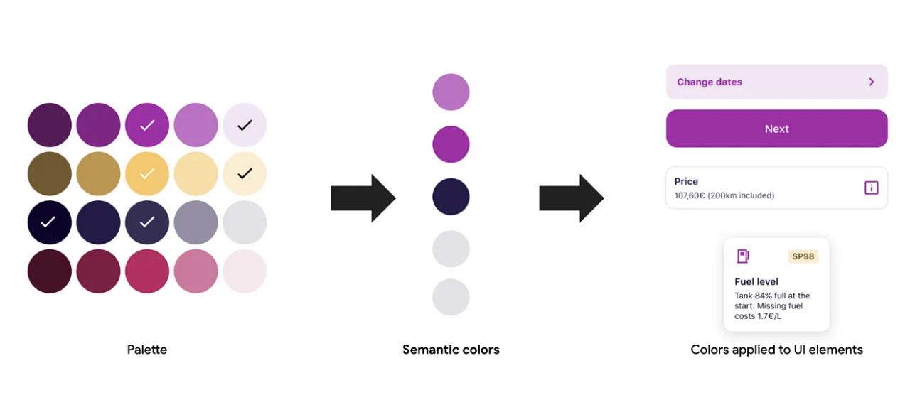
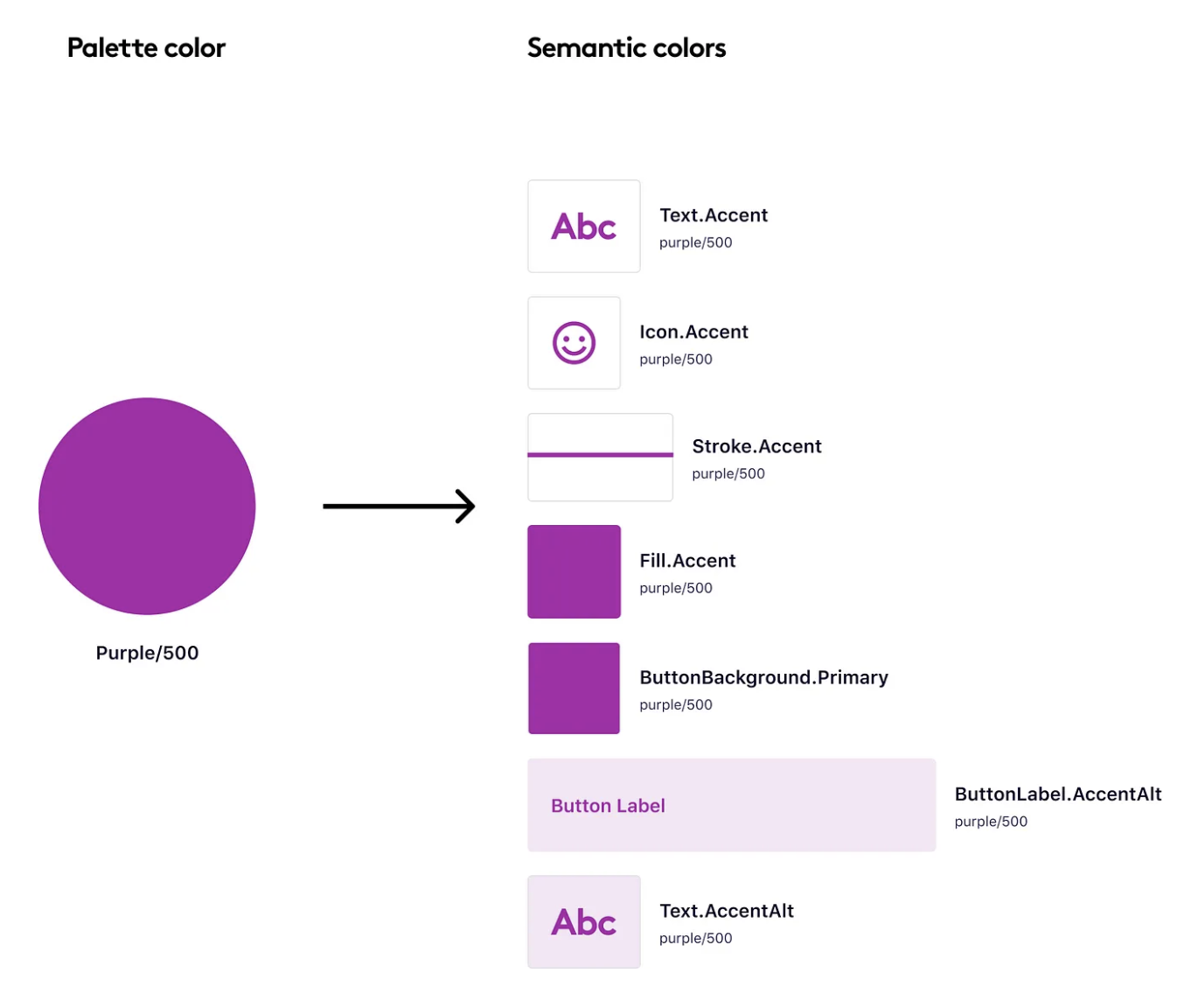
semantic color
UI 요소들의 사용되는 기준으로 구축된 의미론적 컬러 시스템으로
사용되는 목적과 UI에 따라 네이밍하고 적용하는 컬러를 말하며, 컬러 관리 및 유지보수가 쉬워지며 다크 모드에도 최적화된 컬로로 화면을 구성할 수 있습니다.

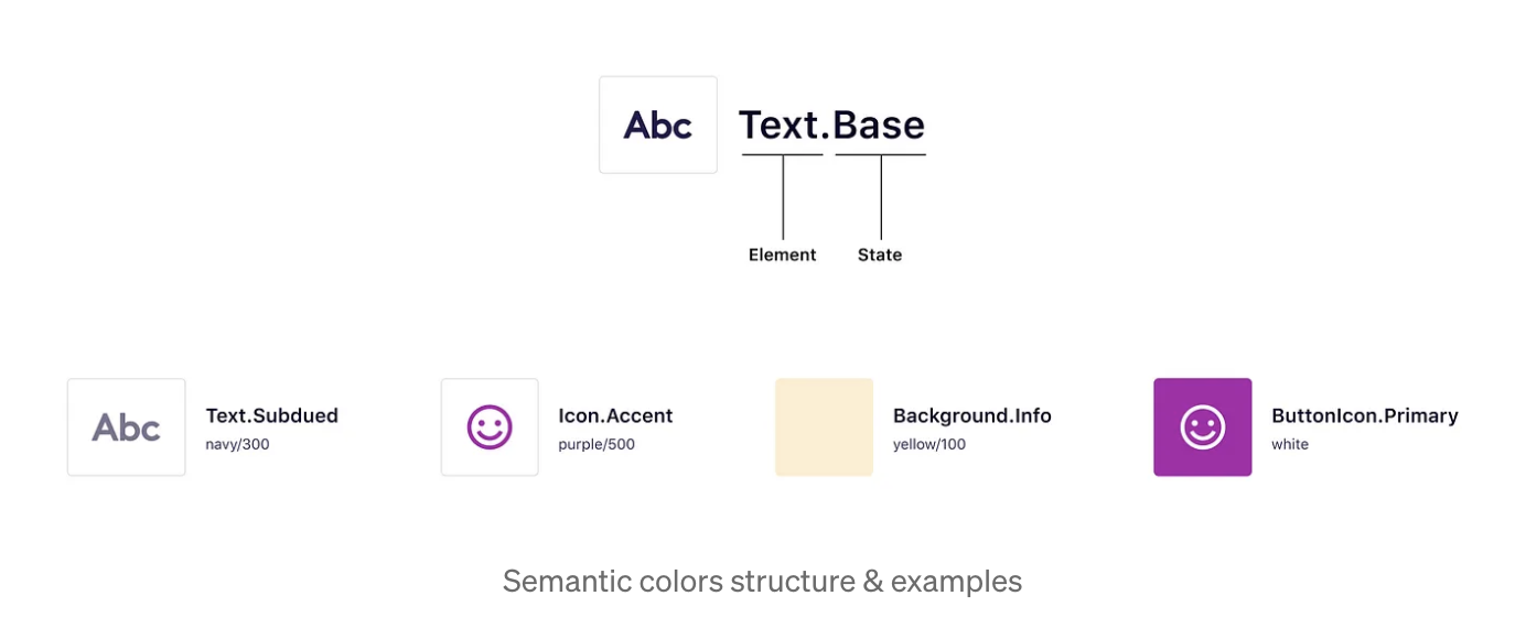
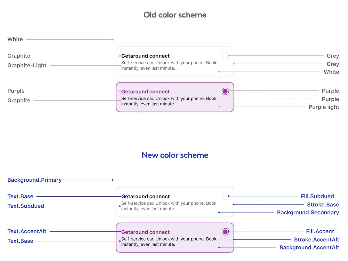

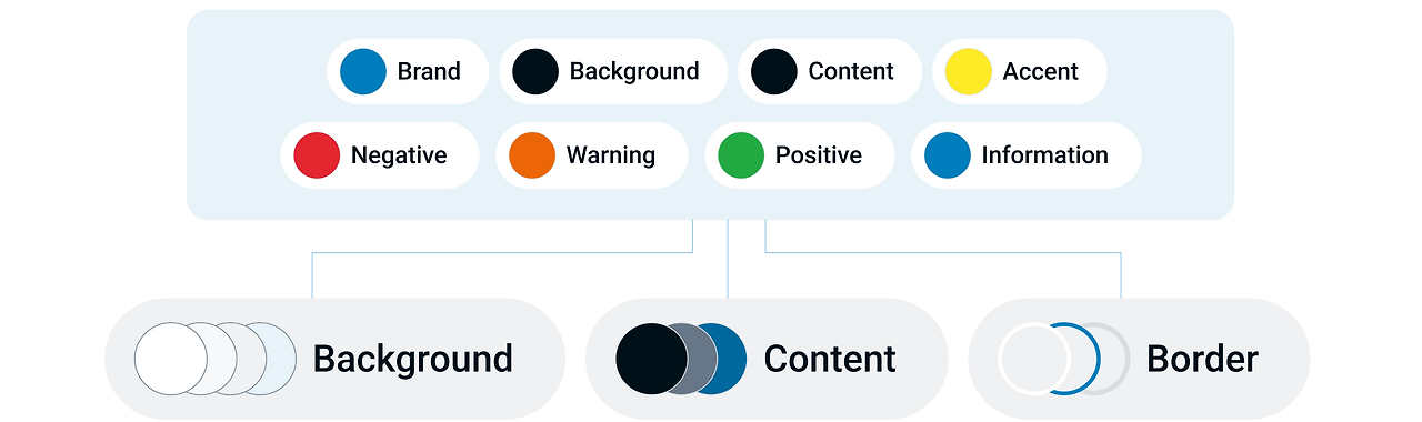

| USE | Color role |
| Background | - 일반적으로 컨텐츠 뒤에 있음 - Primary, Secondary,Tertiary 컬러의 우선순위를 지정하는데 사용 - 브랜드를 표현하거나 요소를 강조하는데 사용 |
| Content | - 컨텐츠 제목, 단락, 아이콘에 적용 - Primary Color와 Secondary Color 색상으로 콘텐츠의 우선 순위를 지정하는데 사용 - 컨텐츠가 Action color와 상호작용 한다는 것을 의미하는데 사용 - 해당 콘텐츠가 활성 및 비활성 상태를 색상으로 표현 (컬러 사용 시 접근성에 주의) |
| Border | - 배경 색상 위 또는 적용된 요소의 테두리 색상 - Primary Color와 Secondary Color 생상으로 우선 순위가 지정된 요소에 사용 - 선택, 성공, 오류 등과 같은 구체적인 의미를 부여 할때 사용 |
Design Tokens on Asana's Design Systems Team - Jina Anne, Ainsley Wagoner, Ivy Wang (Schema 2021)
명암비(Contrast) 확인 및 체크하기
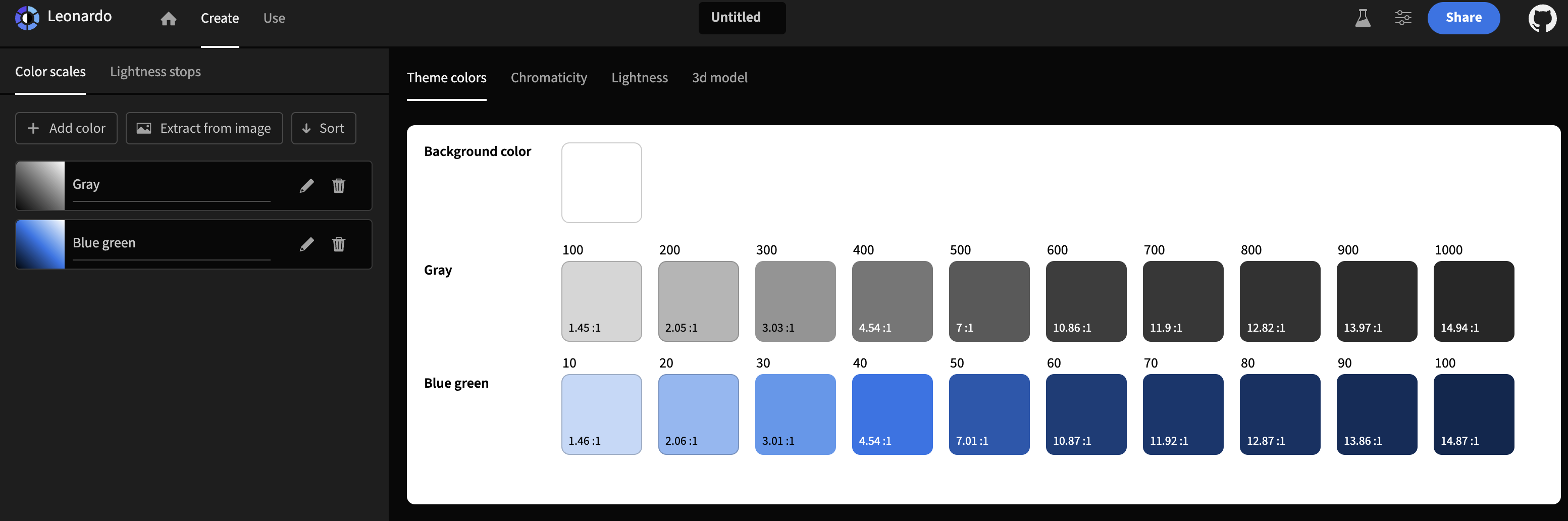
1. leonardocolor
컬러 명압비를 단계별로 만들 수 있다.
Leonardo
Generate colors based on a desired contrast ratio.
leonardocolor.io
2. 피그마 플러그인 (stark contrast accessibility checker)
WCAG(Web Content Accessibility Guidelines)의 AA, AAA 기준으로 표시해줌 (색상 변경은 유료)
Stark - Contrast & Accessibility Checker | Figma
Tired of manually checking spreadsheets, messy handovers, and expensive retrofitting? The all-new Stark Suite is a powerful combination of integrated tools that help you streamline your accessibility workflow. Now, you can create and test accessible softwa
www.figma.com

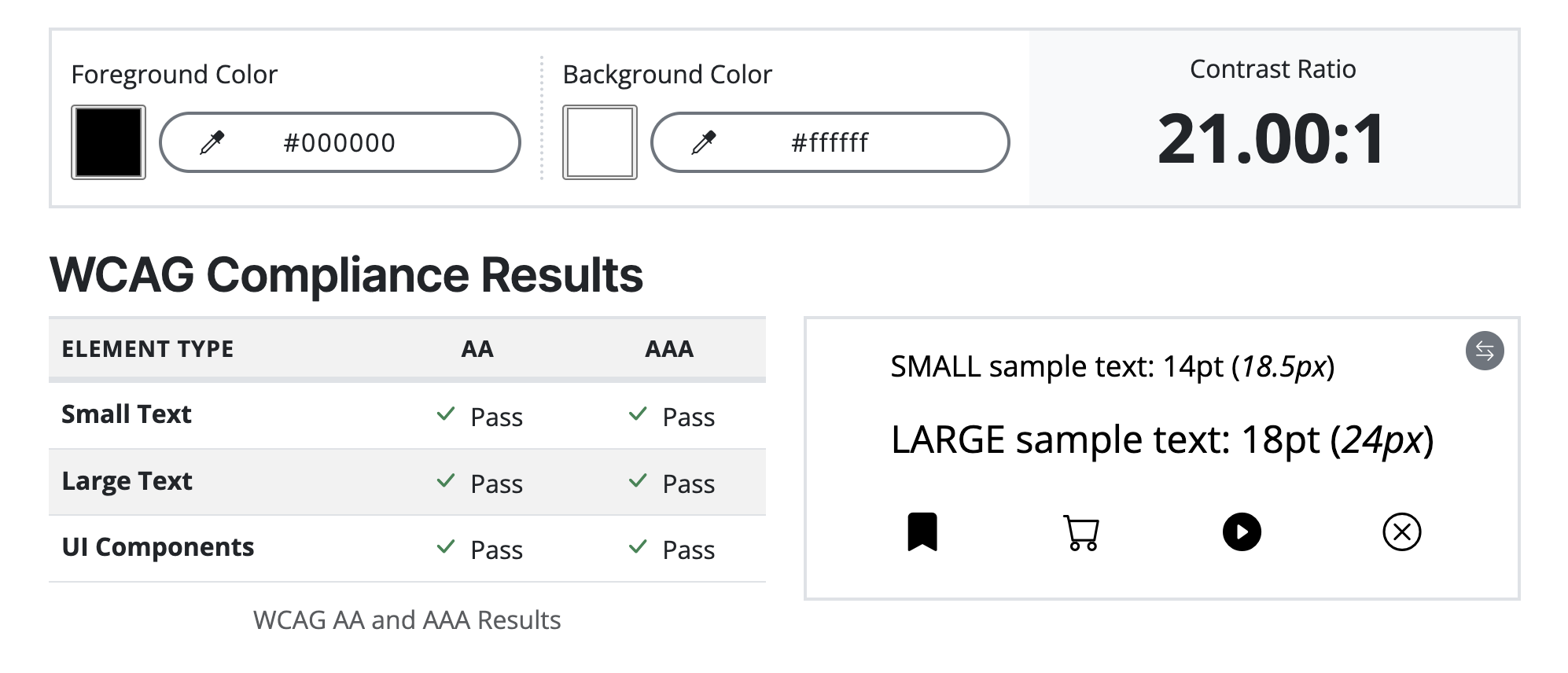
3. accessibleweb
WCAG(Web Content Accessibility Guidelines)의 ELEMENT TYPE을 AA, AAA 기준으로 표시해줌
Web Accessibility Color Contrast Checker - Meet WCAG Conformance
Use our free web accessiblity color contrast checker to check your website's color combinations against WCAG A, AA, and AAA requirements.
accessibleweb.com
4. adobe color
컬러 명암비가 안 맞으면 오른쪽에 명암비와 함께 대비 색상을 제안해 줌
https://color.adobe.com/ko/create/color-contrast-analyzer
color.adobe.com

5. colourcontrast
Colour Contrast Checker
Check the contrast between different colour combinations against WCAG standards
colourcontrast.cc

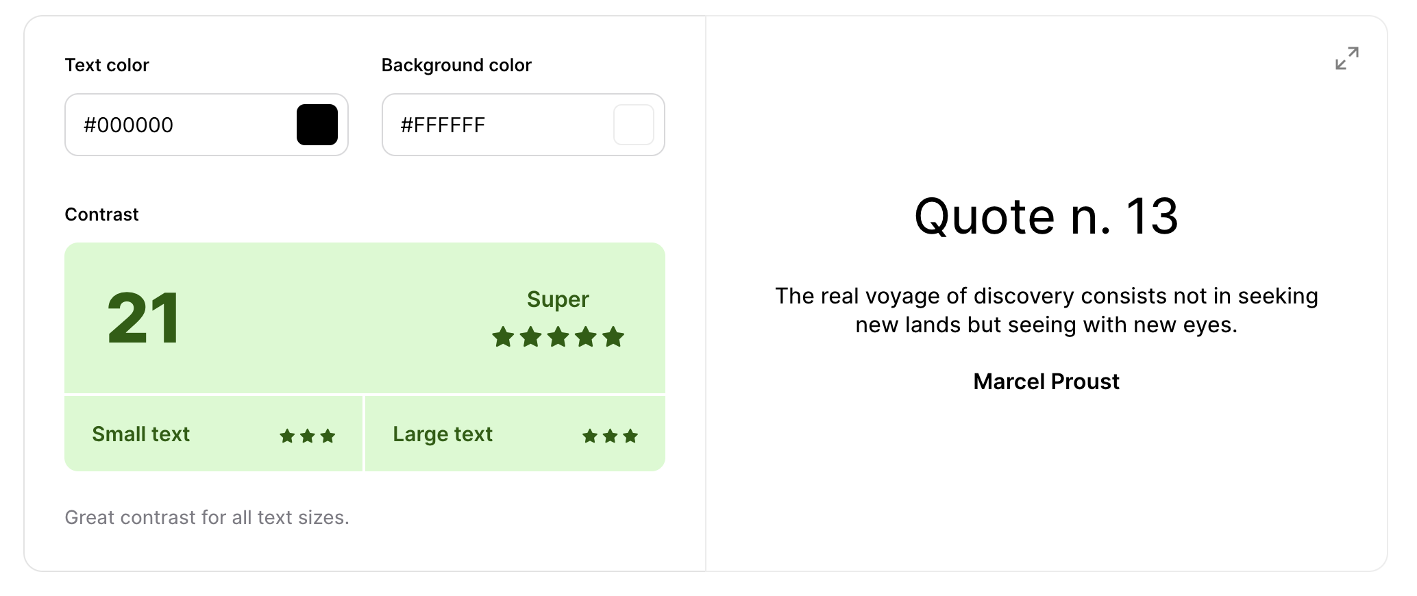
6. coolors
배경색과 텍스트 색상을 지정하여 명암비를 알 수 있고, 전체 화면으로도 확대해서 확인할 수 있다
Color Contrast Checker - Coolors
Calculate the contrast ratio of text and background colors.
coolors.co
7. 크롬확장 프로그램 (WCAG Color contrast checker)
크롬 확장 프로그램으로도 명암비를 간단하게 확인 할 수 있다
WCAG Color contrast checker
To check the color contrast between foreground and background of the texts
chromewebstore.google.com

8. 크롬 확장프로그램 (colourcontrast)
Colour Contrast Checker
Check the contrast between different colour combinations against WCAG standards
chromewebstore.google.com
컬러 샘플 만들기
1. material theme builder
Material Theme Builder
material-foundation.github.io
디자인 접근성 지침 파일
한국웹접근성인증평가원
고객상담센터 02-858-7220 평일 09:00~18:00 (주말/공휴일 제외)
www.wa.or.kr
'개발 공부' 카테고리의 다른 글
| 프론트엔드 / UI 애니메이션 코드 참고 사이트 (html, css) (0) | 2024.06.05 |
|---|---|
| 메모 / 웹앱 만들기, 하이브리드 앱 만들기, 안드로이드 아이폰 앱 동시에 만들기 (0) | 2024.05.24 |
| 메모 / 웹, 앱 서비스 만들어서 수익화하는 8가지 방법 (8) | 2024.05.17 |
| 확인 / 기획 디자인할때 누락되는 것들, 완전한 핸드오프를 위하여 체크할 사항 (0) | 2024.05.15 |
| 메모 / 오래가는 브랜드를 만드는 브랜드 경험(Brand Experience, BX) (0) | 2024.05.14 |


